Building better relationships and healthier communities with a streamlined event planning mobile app
— Event Planning
— Social Networking
— Figma
— After Effects

Research & Ideation
Understanding The Problem
Before Nexev hired a product design team, a beta release of the platform was implemented based on a blue-sky concept created by the founder and developer. The mockups were developed without usability testing and had minimal consideration for technical and product limitations.
I conducted research interviews with primary users to uncover pain points they were experiencing with the beta release. My research focused on:
- Understanding user goals and needs
- Identifying pain points in the existing user journey
- Determining task success rates
Gathering Insights
I compiled a list of usability issues, prioritized by severity, using Jakob Nielsen’s five-point rating scale.
Prototyping The Solution
Based on the identified problems, I worked on addressing these pain points by proposing the following solutions:
- Redesign the nav bar: Consolidate main features into five tabs for easier access.
- Redesign buttons and icons: Enlarge touch areas to improve tapping accuracy.
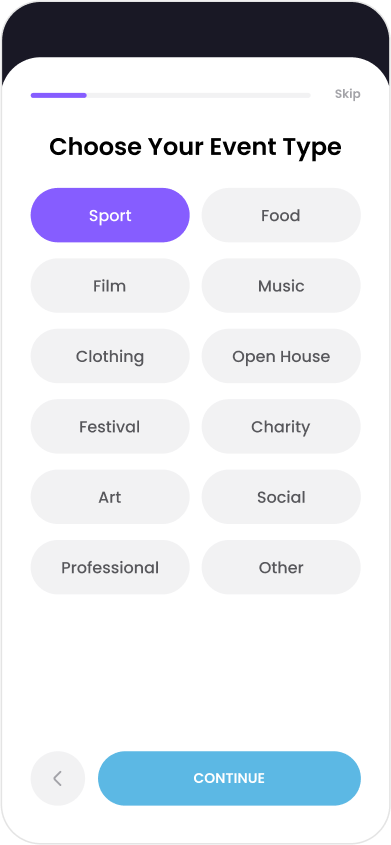
- Redesign the event creation page: Reduce the number of steps to minimize time to completion.
- Redesign sorting and filtering features: Make these tools clearer and more intuitive.
- Redesign event cards on the homepage: Display only necessary information to create a cleaner and more focused layout.
- Enhance event category details: Reference current event planning competitors for inspiration.
- Rephrase description texts in the event creation form: Simplify the language to improve user understanding.
- Enlarge text areas to improve readability.
- Change the current font: Switch to a more common mobile app font, Open Sans, to increase the app's credibility.
Final Prototypes
I proposed changing the brand colors to a more youthful and energetic style. After several iterations and ongoing discussions with stakeholders, I chose a bolder design direction and created the final prototypes for the event creation task flow.


